Designer Vicente Wolf, a master at minimal spaces with soul, is sharing his tips for creating chic, subtle spaces that tell a story.
“To me, neutrals are not about beige, but a subtle use of one or two soft colors infusing texture and shape and balance in the positioning of the room’s elements,” says Vicente Wolf, the New York City designer who has created effortless, elegant spaces for three decades. His interiors are influenced by his many artistic pursuits - photography, travel and art - allowing the spaces to speak strongly via their comfortable modern furniture, monochrome palettes and character-rich objects from around the world.
So just how does he do it? We asked him to speak to eight of his gorgeous spaces to reveal the tips for getting a room to speak softly but pack a major style punch.
For a master bedroom in an NYC apartment, Wolf wanted to up the relaxation factor while creating an intriguing design. “I used a fully upholstered wall in a soft herringbone pattern as the headboard,” he says. Wolf added well-placed furnishings and objet d’arte to add interest. He dressed the bed with Elliot shams, Meridian pillowcases and Nocturne duvet. “The patterns of Matouk bedding and towels are luxurious and mix well together,” says Wolf. “The clean, elegant colors and attractive trims make the bed pop.”
“The patterns of Matouk bedding and towels are luxurious and mix well together,” says Wolf. “The clean, elegant colors and attractive trims make the bed pop.”
Design Takeaway: Even in subtle shades, a strong pattern element can add design drama.
“Our original design of this apartment, located in Museum Tower in NYC, was darker and a bit more traditional,” says Wolf. Showcasing his exceptional eye for mixing texture (cowhide rug, stone sculpture, glazed ceiling) and blending silhouettes (French 18th century chairs with rounded upholstered pieces), the designer strikes a balance of comfortable and elegant.
Design Takeaway: To create design tension, juxtapose rectangular forms with more fluid, sculptural silhouettes.
For Wolf’s own bedroom at his Montauk home, he wanted to play up something beyond the four walls. “The master suite was an add-on I did about two years ago by adding an entire second floor to the house,” says Wolf. “The bed is a custom design made in Bali. And I used Sierra Hemstitch for the bedding. It’s subtle with just a hint of accent…who would want to compete with that view!”
Design Takeaway: Think about what’s outside the windows and echo the colors of nature inside.
For a residence in Sagaponack, New York, Wolf enlarged the kitchen to create a physical and visual openness throughout. Separating the kitchen from dining spaces is a glass-enclosed shelving rather than a wall. “Though mostly decorative,” says Wolf, “it does house the Miele espresso maker and select platter and dinnerware”. The stained and polished terracotta flooring bring a contemporary sense to the space while the industrial-inspired fixtures over the island with carved corner posts evoke a bygone era. “When designing with neutrals, there has to be a blend of tones with accents of stronger colors,” says Wolf.
“When designing with neutrals, there has to be a blend of tones with accents of stronger colors,” says Wolf.
Design Takeway: Don’t be afraid to mix design eras to make a space appear more layered.
The centerpiece of Wolf’s bath at his home in Montauk is a 19th century hammered copper soaking tub. The floor is natural stone, again playing up a blend of textures, shiny to rough hewn. “The bathroom also offers an interesting venue for an art gallery,” says Wolf. Milagro towels are super absorbent, perfect to wrap yourself in after a good, long soak.
Design Takeaway: Artwork adds instant color, texture and visual interest in a largely neutral space.
For a regal bedroom in New York City’s Gramercy Park neighborhood, Wolf created a draped silk curtain behind the bed, enveloping the top side as well. “This created the illusion of a canopy and evokes a nesting feel,” he notes. The designer played up the drama with a carved Venetian headboard, upholstered in silk damask just in front of the drapes but kept the bedding classic and sophisticated with the Terra collection. “In the bedrooms I design, I feel that by layering a variety of hues creates a calm and peaceful space for the end of the day,” says Wolf.
Design Takeaway: Simple, white bedding is a great choice with such an opulent backdrop.
Wolf calls this his take on “a non-beachy, beach house”. In order to balance his East Hampton client’s larger than life persona with the designer’s tranquil, clean and balanced aesthetic, he envisioned an update of an 18th-century Grand Tourist’s library blending cultures and epochs. “To showcase the client’s love of ancient architecture, I adorned the wall with cast-plaster architectural details,” he says. African masks add organic shape and texture to the more formal slipcovered sofa and French tufted ottoman.
Design Takeaway: Keep a tight palette when creating a dramatic collection moment like this. It will keep it from overwhelming the space.
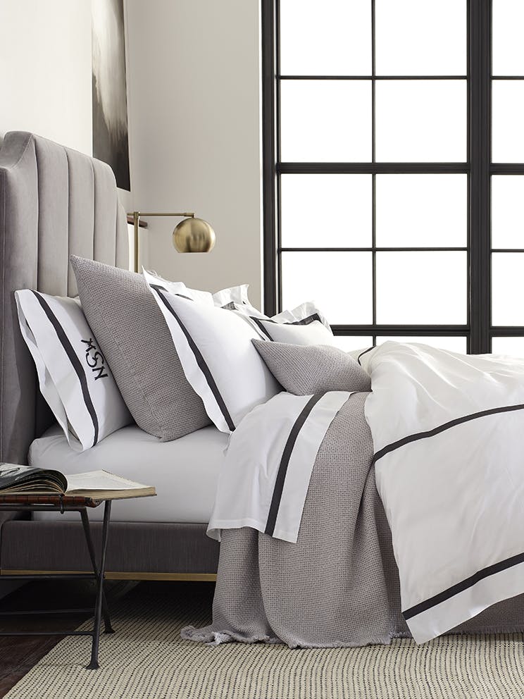
To add dimension to this master bedroom, Wolf created a floating wall of silver leaf with a custom headboard that also floats from the wall with a Chinese desk beside the bed. Bedding is a mix of Allegro and Lowell styles. “I always find what I’m looking for at Matouk,” says Wolf. “I tend to gravitate to the bedding and towel designs with linear trim and softer embellishments.”
Design Takeaway: Don’t feel confined to one bedding look. Mix and match styles to make it distinct and personal.
“I always find what I’m looking for at Matouk,” says Wolf. “I tend to gravitate to the bedding and towel designs with linear trim and softer embellishments.”


