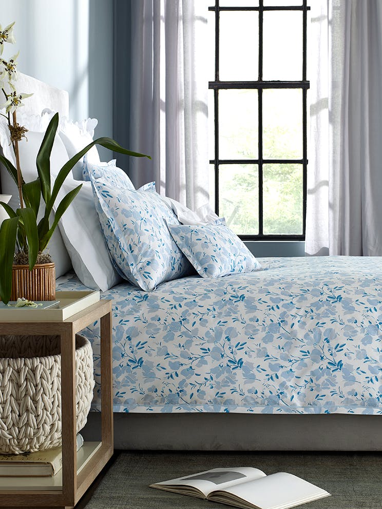
As soon as we laid eyes on this, we immediately reached out to Alexis Humiston, head designer of San Francisco-based ABH Interiors. The romantic-meets-modern wallpaper, Moroccan chest, and heavenly tumble of white and blue bedding left us wanting to see more. Humiston was happy to give us the details about this space that boasts a few surprises.
Since launching her interiors firm after a six-year-stint on Wall Street, Humiston has been charming clients and creating interiors with a thoughtful blend of personal touches and unexpected details, treasured heirlooms with contemporary backdrops. “We focus on achieving the right scale of the interconnected pieces and on creating a harmonious color palette,” says Humiston. “To make each room a place people want to stay, we love to use textures that absorb sound and invite touch.”
The master bedroom and bunk room that Humiston highlights here are part of an 8,500-square-foot-home in a 100-year-old farmhouse, and truly exude the above sentiment. The house, built in 1920, was updated with black floors, mixed material walls, and large factory windows. It was an ideal foundation for Humiston to realize sleep spaces filled with whimsical pattern, calming color, and a mix of distinctive pieces.
The home brings the couple’s love of downtown Manhattan to the calm, bucolic countryside. “We wanted to create a young, fresh, romantic place for weekend retreats,” says Humiston. “The clients are as happy spending time on the farm with their kids and horses as they are hosting friends there from all over the country.”
Follow along for more on this bucolic-meets-modern bedroom space that puts both owners and guests in a dreamy state of design.
If this /bedroom had a name, what would it be?
"A Pastoral Romance”
How did you arrive at this cool, elegant palette?
"We knew we wanted to do a botanical wallpaper, but when I chose this more traditional chintz, I worried it would steer us too far into the past. I decided we should make the rest of the room a cooler tone as a way to keep the overall effect young and fresh. The clients love the balance we achieved.”
The room is large with tall ceilings and large windows. How did you make it cozy?
"This was a challenge. We spent a huge amount of time fine tuning the scale of each piece of furniture. By using larger pieces, such as 32-inch nightstands on either side of a 30-inch high mattress, the room started to feel smaller by comparison. We also broke the room down into smaller parts, such as the seating area at the end of the bed and the desk area in the corner, which really helped.”
Tell us about the wallpaper behind the bed? How did it inform the room?
"This was the starting point for the entire space. It has a very natural feel because the colors are hand mixed and the paper is hand-painted. It features fantastical fronds and dianthus flowers, inspired by an 18th-century sarong. The maker is Soane Brittain, and it is called Dianthus Chintz in Lapis. We made pillows in the coordinating fabric for their daughters’ daybed in the next room, which the little girls love, too.”
There is subtle pattern, but it never overwhelms. How did you find the balance?
"We put a lot of focus on creating a cohesive color palette for the room so that we could tie together different patterns, textures, and shapes harmoniously.”
How do you think about texture in a bedroom space?
"Every texture must be soft and inviting, especially in a bedroom.”
We love the fun yet practical bunk beds. How did you approach the space?
"The room has a lot of play space to offer (and to potentially compete with at bedtime), so we wanted to make the beds feel fun and consistent enough so that kids are excited to all get into them at some point.”
What was most important to you in terms of getting the bunk beds right?
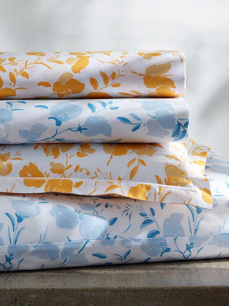
"We wanted this room to be indestructible and inviting. The patterned sheets disguise any wear or stains better than solid sheets and they ensure both kids and adults enjoy being in the room.”
Any traditional bedroom design rules you like to follow or break?
"In the master bedroom, we used a much larger area rug than people often do, but we all loved the coziness and softness it brought. The clients also wanted a very tall mattress height, which ended up allowing us to do a sofa at the end of the bed in a matching height that feels very comfortable.”
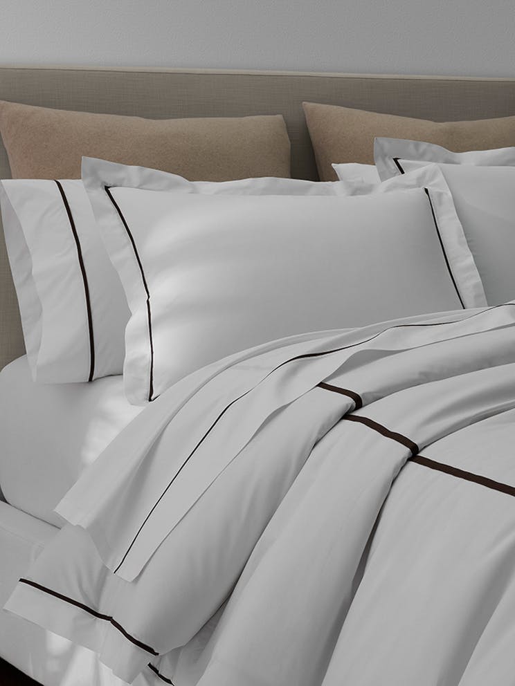
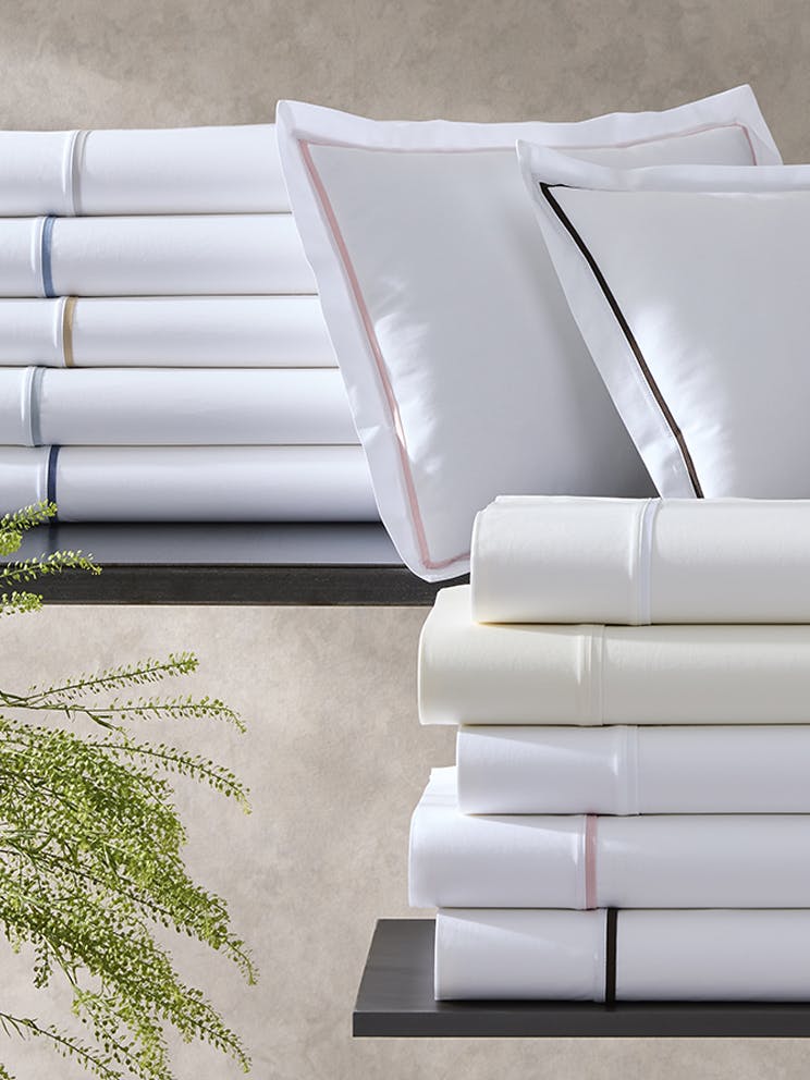
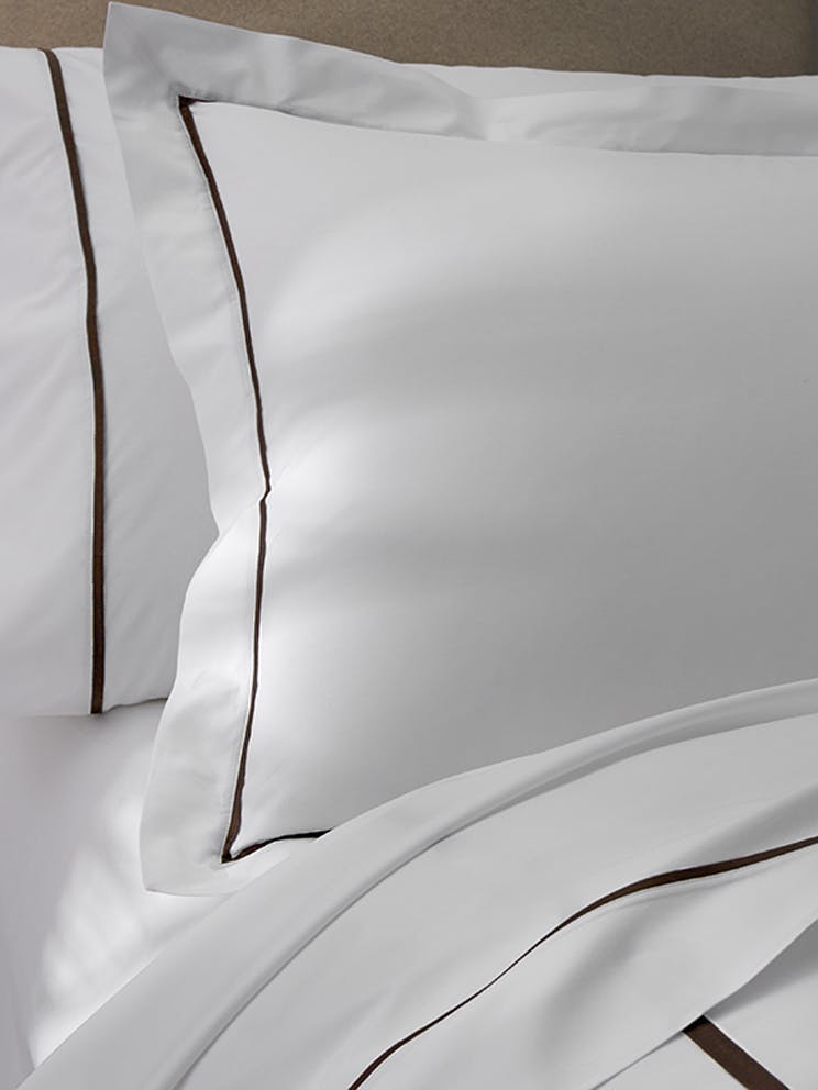
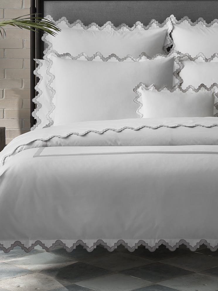
Tell us about the Matouk linens you used in both bedrooms.
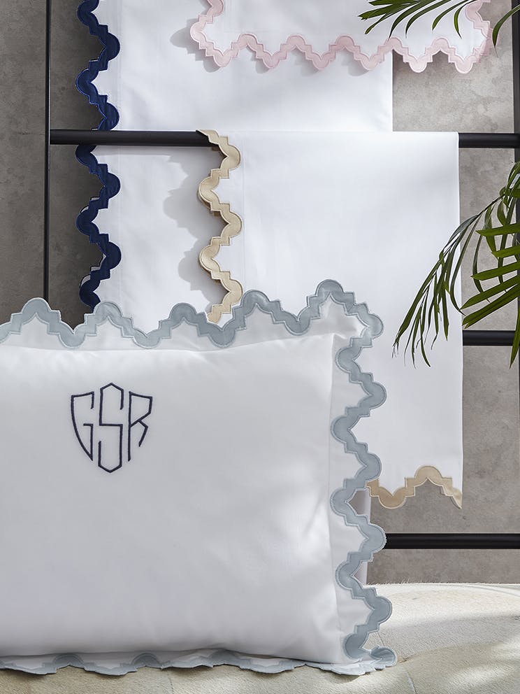
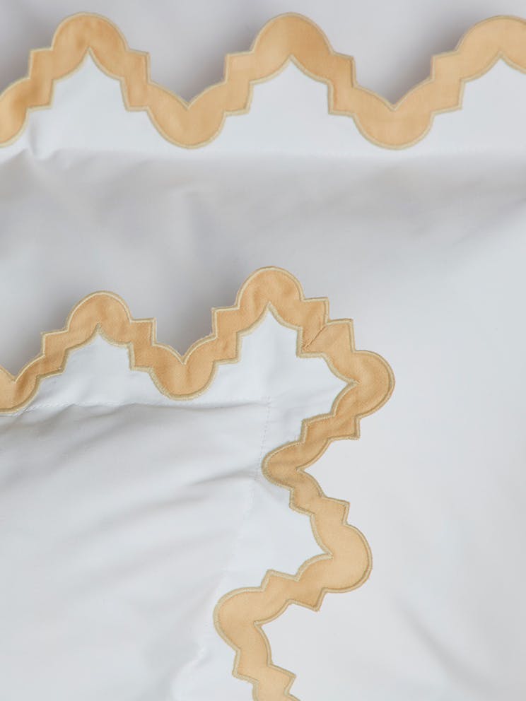
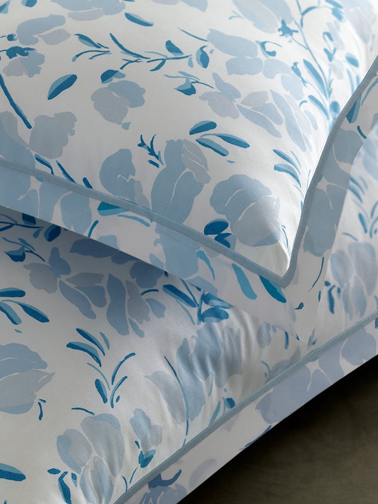
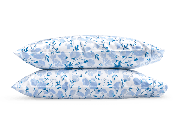
"We loved using Matouk in these rooms because both designs feel extremely fresh, while still allowing for a romantic feel for the master bedroom and a playful vibe for the bunk-bed space. The color palette was really important in the master bedroom and the soft aqua color was the perfect contribution to the room. I loved that this soft blue was available in a variety of Matouk styles so that we could have some layers with clean lines and others with whimsical shapes.”
Our Own Edit Note
For those in the San Francisco area, be sure to contact Sue Fisher King or visit the store's website, which offers a comprehensive selection of the highest quality home goods and linens, including Matouk.
“Every texture must be soft and inviting, especially in a bedroom.”
