This Nashville designer creates a girl’s room that is the perfect mix of sweet, sassy, and chic.
"I would describe my style as Modernly Traditional,” muses Nashville designer Blaire Murfree. “I love the juxtaposition of classic furnishings and fabrics with modern design elements.” One quick look through her firm’s portfolio confirms this knack for blending aesthetics with ease and putting her distinct mark on her interiors in the process.
A graduate of Vanderbilt University, Murfree had a career in both health care and business before transitioning her talents to a creative pursuit. Her particular command of blending fine art, vivacious textiles, and a clever mix of pattern, texture, and color has attracted the attention of a huge roster of clients around the Nashville area and beyond. Not to mention design magazines and blogs that have followed and showcased her spaces.
For the bedroom of her eldest daughter, Murfree had the tough task of creating a “Big Girl” room in her own home. “Our home is a modern Cape Cod,” Murfree explains. “It’s a new build so I attempted to add character with some architectural detailing, layers, and a mix of old and new.”
Murfree graciously showed us around the space, giving invaluable insight into creating a bedroom that speaks loudly but carries a classical tone throughout.
If this bedroom had a name, what would it be?
"Shirley Temple Over Ice.”
This is a super tight sleep space. What was your initial approach?
"My daughter's bedroom was tricky to deal with in terms of layout. The space forms a narrow “T shape” because of our Dutch gable roof. The only spot for a full-size bed is right in front of the window. While I typically do not block a gorgeous window, it was the only option here. So because the window could not be the focal point, I made sure the bed itself became the main attraction. The canopy gives a private hideaway feel that all kids love! Aesthetically, the canopy was the perfect opportunity for me to take something that is conventionally very traditional (and even formal) and put a modern, playful spin on it.”
Pattern and color play an important role in this space. Where did you start?
"I started with the palette. Periwinkle was the color of the first room I ever designed...my own childhood bedroom. I became obsessed with the color while studying the work of Matisse for my 6th-grade art project. I then drove my parents’ interior designer crazy insisting that all fabrics be a true periwinkle color. I loved the color combo of lipstick red, hot pink, periwinkle and just a touch of lavender. That’s where it all began here. I loved the large scale of the Katie Ridder's “Leaf” wallpaper as I didn’t want to overwhelm the long, narrow room. The negative space in the pattern gives the eyes a place to rest. I wanted a tight, abstract pattern to contrast the main print and love the idea of supporting a local artist. I was so excited that one of Electra Eggleston’s fabrics worked perfectly color-wise.”
What are the other key elements that tied the look together?
"This room is all about contrast and balance achieved by way too seemingly opposing forces that somehow complement each other. Feminine and masculine vibes, warm and cool tones, loose and tight pattern, old and new pieces, traditional and modern furnishings, soft lines and tailored shapes. I believe that when a room lacks contrast, it lacks interest and warmth. This contrast can be more subtle and achieved with furniture silhouettes and upholstery styles alone or more boldly, as I did in this room.”
Are there any traditional bedroom design rules you like to follow or break?
Scale Smartly
"There are rules anyone can keep in mind when mixing patterns. Combine a large scale and small print to work. Also, a geometric always grounds a floral and vice versa.”
Soften Up
"I tend to still think about if my “leggy” items in a room are balanced by something soft and skirted. I think that one was instilled in me by my mom.”
Have a Dark Moment
"Like Sister Parish, my grandmother believed every room should have something black. I can still hear her in my head when I'm working on a room and throw in a black and white decorative box or a piece of art."
Let There Be Lots of Light
"A space should have multiple lighting sources...recessed, overhead, table lamps, reading lamps, scones. This bedroom has them all."
Any advice for working with a kid’s sleep space in particular?
"First, make the big pieces classic enough to grow with your child or be used elsewhere in your home. Second, there is a way to do durable without buying things specifically made for kids. The rugs in both of my daughters’ rooms are either indoor/outdoor or treated so they are stain repellant. I try to avoid bedding that needs to be dry-cleaned in a young person’s room. That just makes things more difficult. Rooms need to be lived in...especially a kid’s room.
Also, whether you are creating a child or adult space, try to incorporate at least one old or sentimental item. I’m not in the business of making showrooms, I want to create spaces that make a home and tell the story of those who live there. A kid’s room is the perfect place to have some fun and take a risk you might not feel comfortable doing elsewhere. These colors are bold. I wouldn't want them in a fancier room but I hope they inspire my daughter to live creatively, be willing to take some risks, and fail from time to time.”
"I want to create spaces that make a home and tell the story of those who live there. A kid’s room is the perfect place to have some fun and take a risk you might not feel comfortable doing elsewhere."
Tell us a bit about the bedding you chose. Why was it right for this space?
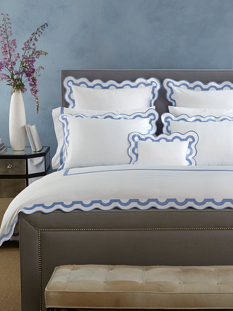
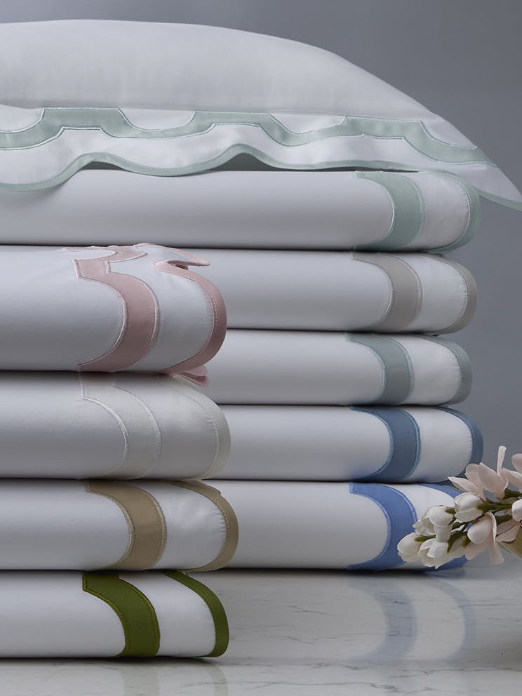
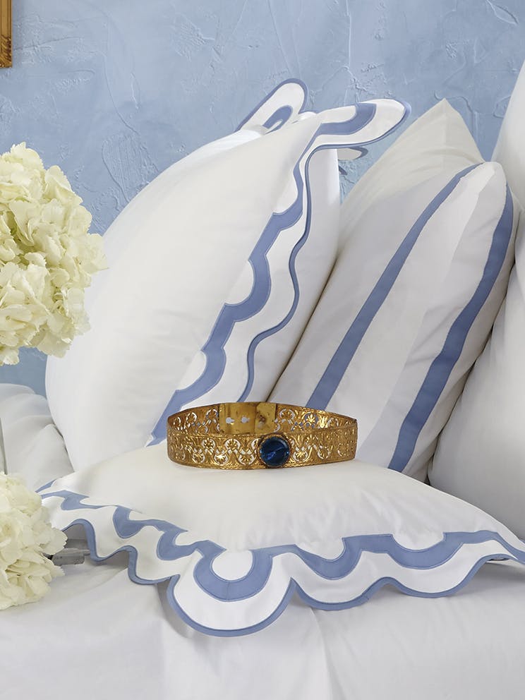
"I’ve always loved the scalloped edges of the Matouk Mirasol bedding. If this color had not worked perfectly, I would have custom colored it. The scallops are feminine and fun at the same time. And the look is ageless, working just as well for a little girl as for a teenager or a guest staying here.
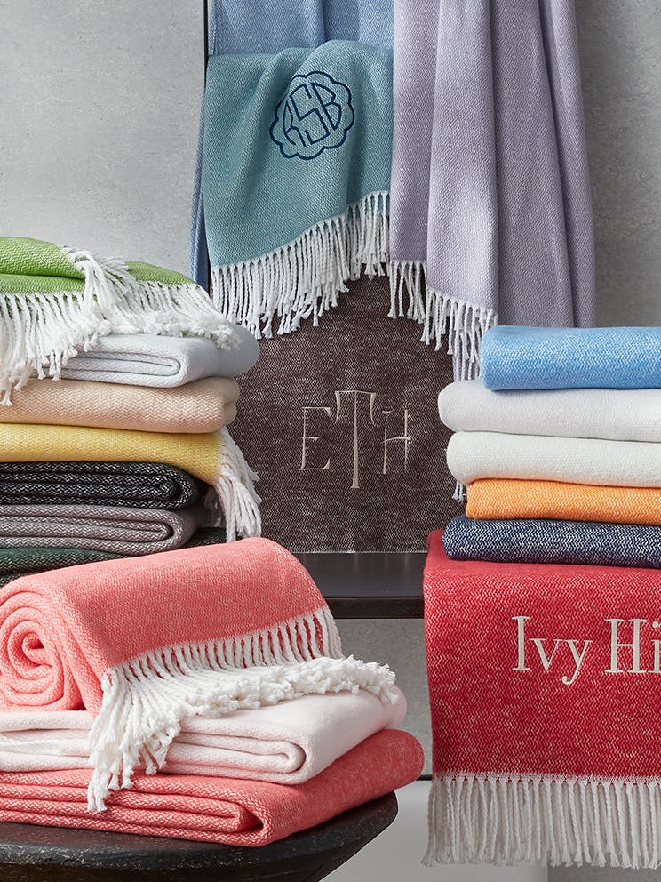
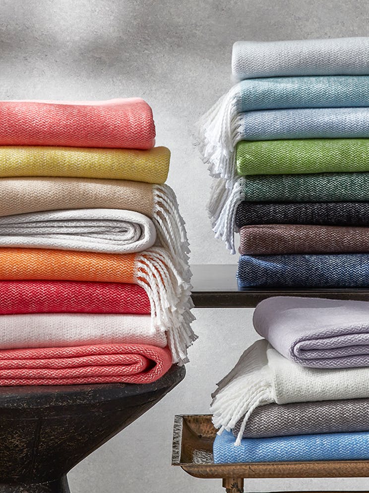
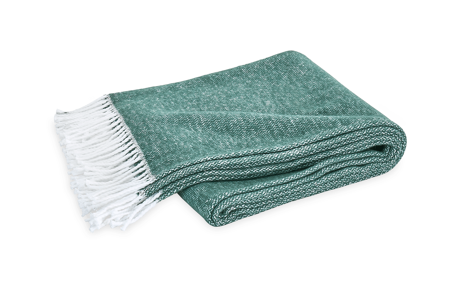
The Gemma Quilt tied in nicely and again offered a tight geometric pattern to contrast our combination of both looser and more abstract prints and soft feminine tones. The addition of the Pezzo Throw was all about layers. There is nothing more inviting to me than a well-layered bed. After sheets that feel good to the bare skin, I think it’s important that a bed include a coverlet or large blanket, a fluffy, yet breathable duvet for extra warmth and comfort, and a throw blanket to give you the option of adding an extra layer over your body, your feet, or as a second blanket on night when just a coverlet is used.”
Any final words...
"We love Matouk. There are so many options with colors and materials. We could source Matouk in every bedroom we design be if for a child, adult, man, woman, vacation house or formal home. There is an option for everyone and every type of bedroom space.”
