When we came across this striking bedroom on Instagram, we had to know how the designer dreamed up a look that is at once classic and modern, bold and tailored. We found the creative mind behind the room, Shazalyn Cavin-Winfrey, whose firm SCW Interiors is based in Alexandria, Virginia. She describes her design style as “eclectic to bohemian to transitional” and is quick to add that it’s all about the individual. “I think my work can be described as a personal narrative,” says Cavin-Winfrey. “Being able to adapt to each client and their personal homes is the hallmark of great design.”
For the owners of a 1918 brick Georgia home in the heart of Greenwich, Connecticut, the designer honored existing architecture while amping up the color and adding lots of witty details. The result is a modern take on classicism, elegant but far from understated or staid. Case in point: this sleep space. “This room belongs to their son,” says the designer. “It was important that the pieces reflect the age of the home with a modern twist.” We swooned over the clever mix of pattern and thoughtful details so we asked Cavin-Winfrey to share her secrets for putting this room together along with inspired ideas for any space.
Read on to see how to capture some of Cavin-Winfrey's design magic for your bedroom.
If this bedroom had a name, what would it be?
"Trad soup.”
You are clearly not afraid of pattern. There are such strong statements here but they work beautifully.
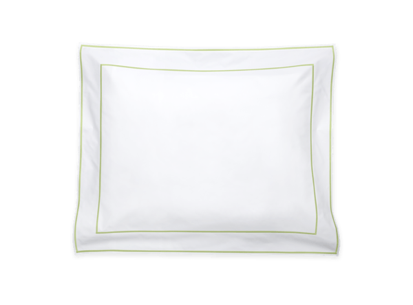
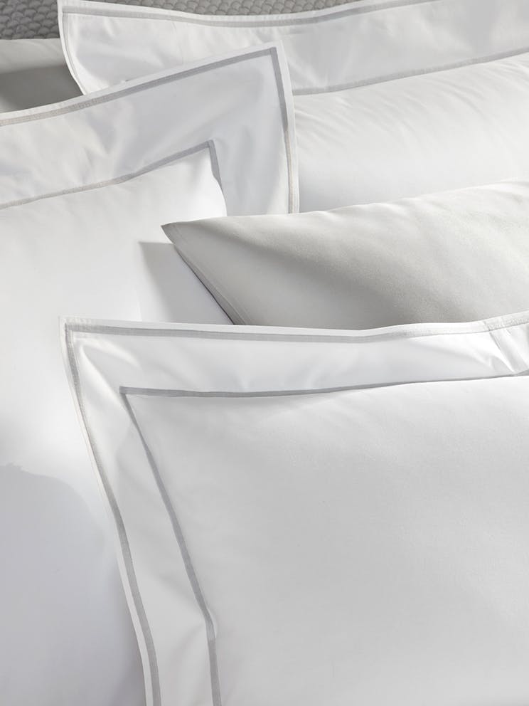
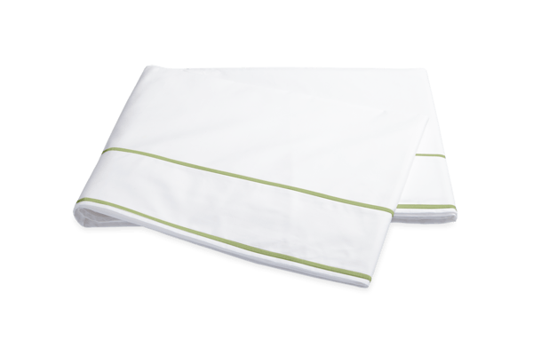
"I started with the rug and the pieces we were absorbing from their former home. The bedside chest used to reside in their foyer; the opposing blue bedside table was in their study; the large horse painting was part of a larger grouping in a former stairwell. The blue chair was in a boy’s bedroom. The French antique lighting with it’s black and gold served as a grounding tool. The trick was to give the space levity in an otherwise formal home without feeling unapproachable. Layering in patterns with varied scales as well as fabric makes the room appear as if it evolved over time. The striped wall covering is grasscloth and the drapery has an applique detail that brings dimension and richness to the pattern. A tiny blue dressmaker cord is applied to every edge so as to clearly define the stop-start point on the windows just like the small edge on the Matouk Ansonia linens. It serves as punctuation and it is these nuances that give it such visual delight.”
What was the centerpiece in this room?
"I always say it is the sum of the parts. It is important to love one particular piece going into the room and build from there. Too many times people think they have to have a visceral reaction to each piece in play when in reality it is the sum that makes the space glow.”
The palette is classic but still feels modern and fresh. What’s your secret?
"I knew I wanted to use blue trim in the room but I didn't want it to match the walls. I imagined the blue trim acting as a frame for the space. If I had to narrow it down, the palette is really blue and beige but it is the red accents in the small flame stitch on the chair and in the bed linens that make the space most interesting. The rug is a classic. It's the first time in years a client has wanted a traditional non-muted oriental rug so it was fun to do a space that had your “grandmother’s” rug but did not feel like your grandmother’s room. I think it is so important to insert pieces from the past in every space no matter the style.”
What are the key layering pieces you used in this space?
"I had most of the pieces to work with from their prior home. It is a delicate dance. The drapes would not be nearly as interesting on a plain, painted wall and the bed would not be as striking without the red detail in the sham’s monogram. Typically, there’s one jumping off piece and I would probably say in this room it was the rug, which I selected early on but which I do not feel drove the space. When I designed this room, it was more about a feeling I wanted to evoke and I think we accomplished that.”
“I think it is so important to insert pieces from the past in every space no matter the style.”
The tailoring is so strong here. How do you make a room look so pulled together?
"When I start a project, I try not to rush it. The base pieces are what they are but it is the attention to things like trim, nail heads, monograms, lampshades, and special tissue box covers, that make it so luxury. It’s not for everyone but the wife has a background in fashion so she understood the need to push it to the next place. It’s often a compromise with details as they take time, quality execution, and often add to the bottom line, But oh, the outcome is so gaze-worthy.”
Any traditional bedroom design rules you like to follow or break?
Make it a Priority
"We spend more time in our bedrooms than any room in the house. So many clients will budget for this space last and the truth is that it is value added to your overall morale to sleep in a space that nurtures your body.”
Don't Skimp on Textiles
"Buy the best bedding you can afford and use proper care and it will last a lifetime.”
Think Big
"If I had to think of things that I like to employ in bedroom design, it would be to scale the bedside tables much larger than you think you can. I prefer a chest, or desk or a grouping of some sort of high and low pieces.”
Don't Go Too Dark
"Dark trim is one thing, but I shudder at dark walls in rooms where you sleep. Something about waking up in a dark space depresses me.”
Can you give us 3-4 tips to keep in mind when trying to achieve this look?
Add Detail with Paint
"Make the trim an alternate color from the walls. Even if you don’t use wallpaper it creates visual interest with cleaner lines. Don’t paint the ceiling white. White ceilings can create harsh lighting so go with something that has a calming effect.”
Frame Your Windows
"You don’t have to do big drapes to have this look. Simple inside mount shades in a geometric pattern or stripe feel masculine and clean. The trick is to have something that does not completely obscure the window in a bedroom when you are not sleeping. Your colored trim serves as the frame to those treatments when selecting the shades.”
Cover the Floor
"Even if you have wall-to-wall carpeting, you can layer in a rug. Rugs help define and balance spaces. There are so many traditional rugs on the market at tons of price points.”
Mix Old and New
"This room would not have worked with a wood bed. It’s about the mix as much as it is about the sum of the parts. If you have a wood bed, consider a skirted bedside table to bring balance. Don’t get hung up on time periods and pieces. The right balance of periods creates the best compositions.”
Tell us a bit about the bedding you chose. Why was it right for this space?
"These Ansonia Shams were perfect. The appliqué monogram and the satin-stitched edges are simple and masculine. They are the icing on the cake. The white versus ecru is a classic.”
Was it always a foregone conclusion you would go with a monogram?
"Yes! I love a monogram. Nothing says permanence and commitment like a monogram.”


