Suzanne and Lauren McGrath, the mother-daughter design team known as McGrath II, create spaces that blend grace and classicism with a relaxed modern vibe. Each space draws in their growing array of clients, from young families to empty nesters, with styles ranging from traditional to contemporary.
They’ve been bringing their distinct eye and background in interior design and decorative art history to spaces since they established their NYC studio in 2010. “For us, it’s all about seeing a space with fresh eyes,” says the pair.
Their first book, Good Bones, Great Pieces was published in 2012 and their work has appeared in Architectural Digest, The New York Times, House Beautiful, Traditional Home, Domino, Lonny, and Better Homes & Gardens.
When we came across this elegant, cheerful boys’ room in their portfolio, we couldn’t wait to ask them how it all came together. Read on for some of their clever design ideas and shop the Matouk linens used to recreate the look.
If this bedroom had a name, what would it be?
"All-American. This is an apartment we designed for a young family on Park Avenue in Manhattan. The client wanted the space to feel glamorous and elegant but still family-friendly and comfortable."
What are the key elements that make it come together?
"We wanted the room to have a limited color palette of red and blue. It was also important for it to feel appropriate for the two young boys who live here (ages 4 and 6), but still be sophisticated enough to feel right ten years from now.”
“We love mixing contemporary art in more traditional settings and it works even in children’s rooms."
How did you strike a balance with color and pattern?
"The key to making the red pop and feel fresh was layering it over the softer blue pinstripe wallpaper. The paper is a classic for boys’ bedrooms because it looks like men’s shirting.”
Any traditional bedroom design rules you like to follow or break?
"We love mixing contemporary art in more traditional settings and it works even in children’s rooms. The Ellsworth Kelly prints were a great way to add a modern element to the space. The mid-century bedside table is a nice juxtaposition to the more traditional elements of the room.”
Can you tell us some ideas for recreating a look like this?
Color Matters
"We like reds that have a little bit of orange in them. It keeps the color feeling cheerful and not too serious.”
Find Balance
"Every room needs a balance and this one is no exception. The most successful rooms are about contrast—the right mix of light and dark, bold and more muted.”
Invite Character
"Adding a vintage, one-of-a-kind element, like the blankets on the beds, gives the room a fun twist.”
Tell a Story
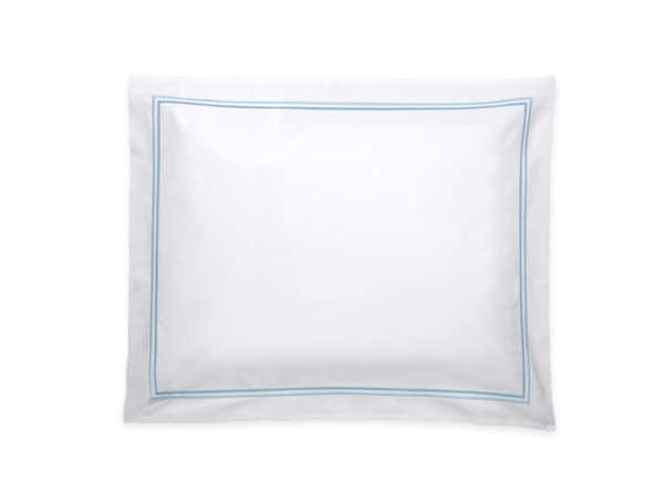
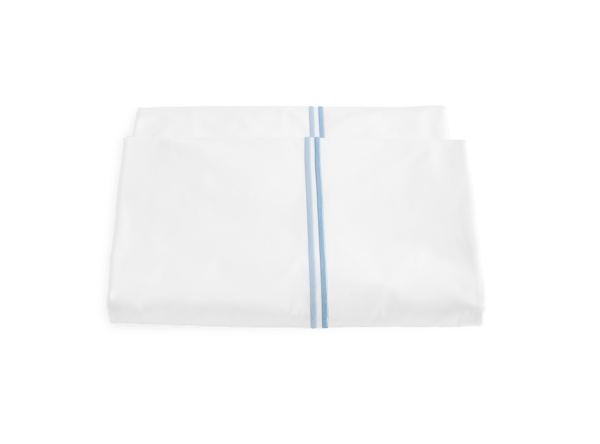
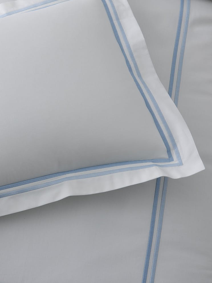
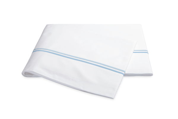
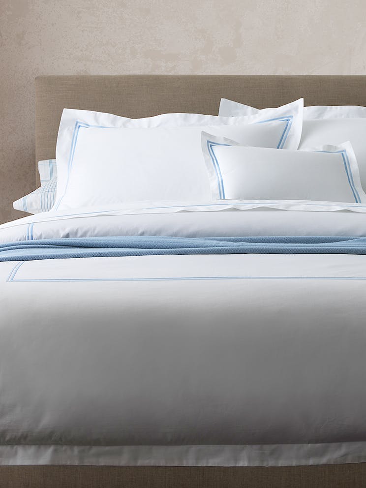
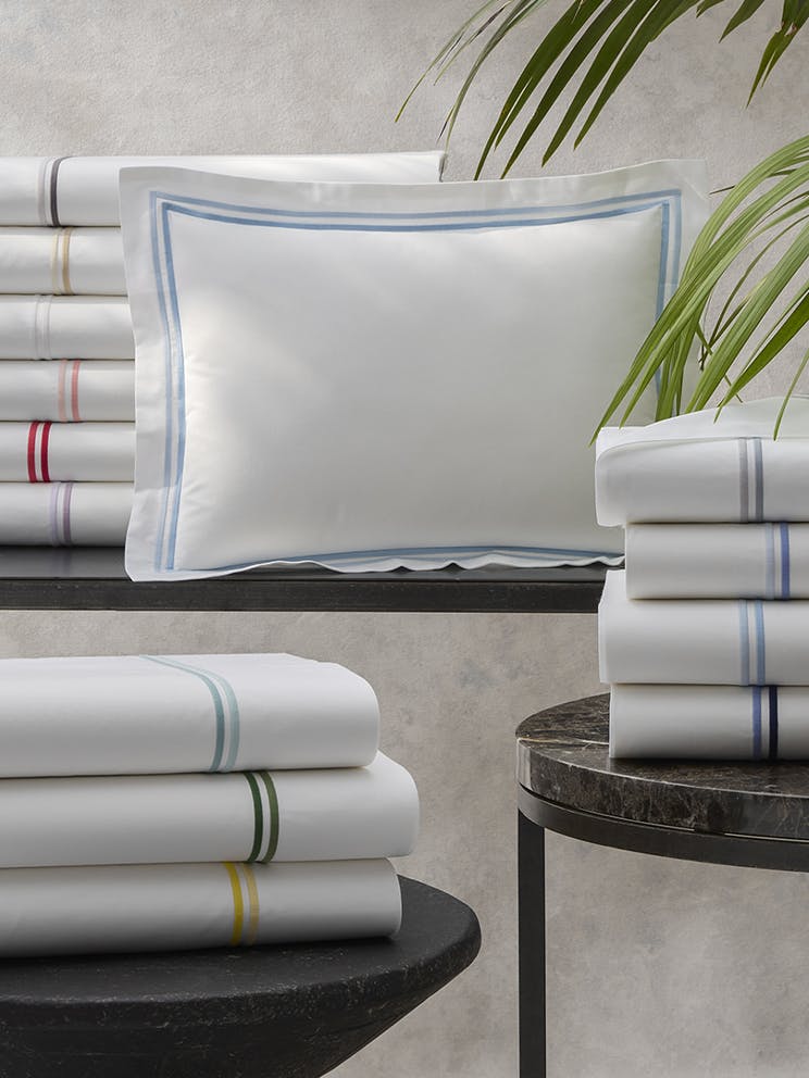
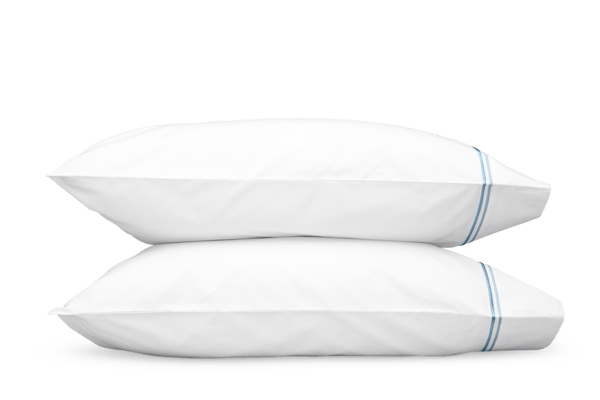
"Crisp white sheets are the finishing touch to any bedroom—nothing makes a room look more complete! We chose Essex because we wanted something boyish and tailored that echoed the classic all-American look we were going for. All of the Matouk colors work so well in the interiors we design. While we love to do custom color, we often find there's no need with Matouk's wonderful range of in-stock hues.”
“The most successful rooms are about contrast—the right mix of light and dark, bold and more muted.”


